
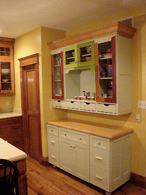
I have mentioned before, that we ordered about half of all the cabinets in our house in "paint grade poplar" meaning the cabinets were delivered and installed unpainted in order to save a few shekels. I really enjoy painting and thought it would be no trouble at all to paint twenty odd cabinets myself.
Har Har Har!
I think I will have unpainted cabinets in my house until I am ninety years old at this point. And even funnier is that I actually did paint the kitchen hutch already!
Yeah - isn't that funny!
Isn't that just the funniest thing you ever heard?!?
I am laughing really, really hard right now.
Tears are just streaming down my face, I am laughing so hard.
Wait! I'm not laughing... I am sobbing!

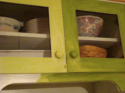
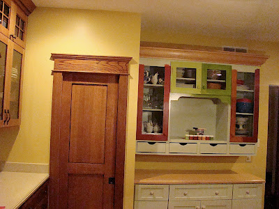
But I have never really liked this faded greed on the hutch. Actually - I do like the color. I just don't like it on the hutch. Actually I do like it on the hutch. I just don't like it on the hutch in this room. The kitchen is painted in a very nice warm yellow and the washed out greenish/blueish hutch has never looked right to me.

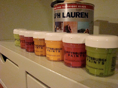
Believe it or not the door above is actually painted in two different colors. One side is a deep orange and other side is a cardinal red. I ragged a brown glaze over both colors. What do you think? Can you even see a difference?

This is the closest color I could find to a pumpkin... because I just had to try a pumpkin color on my hutch. I also used the brown glaze over the top and I love this color... I am just not sure I want my kitchen hutch to be this color.

This is a deeper red with the brown glaze over the top.
Then I got tired of the reds...
So I decided to try a few greens. I just had to try them. The samples are cheap and I just had to see if a "harder green" would do the trick for me. I especially like the darker green, but again I am not sure it is the right choice for the hutch.

Do you see a color that looks perfect?
Please don't tell my you like the original color!
Because it is not going to be easy to cover up all that red paint!
While I was at the paint store, I happened to notice that they had a huge wallpaper book collection, so I took a break from my hutch paint color spasms and flipped through a few books.
I am usually the type of person that likes to drag home as many samples of certain materials as I can get away with. I will lug twelve carpet samples, nineteen tile boards, and four hundred paint chips home, spread them all out, and glory in all the possibilities for days. But the wallpaper books were different. After looking through several, I stumbled upon one that instantly made my heartbeat erratic. My pulse quickened. My skin glistened with sweat. My bosom heaved. Every page in the wallpaper book felt like a scene from a Jane Austen novel.
I guess you could say that I judged the book by it's cover.


And as tears rained down on my cheeks....

I whispered the dearest feelings of my heart...

You had me at hello...

You... had.... ME... at... HELLO!
Huh?
Oh yeah - so if you have an opinion on a good color for that horrifying hutch up there please let me know.
Because the clown look is really not working for me.
Muy Muy Appreciado,
Rechelle
62 comments:
I like the darker green on the right hand center door....it really pops against your warm yellow walls. I think you're definitely right about the old green. It's too weak a color for your room. I have to say....I sure love your house!
So, If you really don't like the lines of your hutch, it would disappear if you paint it the same color as the walls and then the "stuff" in your hutch is what you would see, not the color of the hutch. Also, if you have too much "stuff" in your hutch, you might want to put fabric on the back side of the glass so too much "stuff" doesn't overwhelm the simplicity of the hutch.
I'm all about the red. Red on yellow, hello hunger! Those colors make people hungry which is why they use them for McDonald's Burger King, Wendy's...
But really, I love the red against the yellow. And since there is really just the frame, I think it would be very nice.
However, if you are going to do some of the pretty dainty flowers, red is not a good choice. A deep brown would work and so would black. Did you know that some black should be in every room to help ground it? Once piece will do.
I really like the red. Or a chocolate brown.
You're gonna hate me, but I like the original white/off white color that you're painting over. But, since you don't want the original color, I'd say "no" to either green but then the reds and pumpkin colors don't blend well with your other cabinets.
Do you have any other choices?
I keep forgetting you have this other blog. I need to come over here more often!
Judy in Maine had a nice idea. I personally like the warmer red a lot...
I love the pumpkin against your deep yellow. And as a habitual user of the reds, I think I can safely say that you will tire of the reds (and the green) more quickly then the pumpkin....of course, that's just my little 'ol opinion.....
What other color do you have going in your kitchen? The red is nice if you have some other red, like cannisters, etc. If you like blue, maybe a blue (not bright) coordinating on the color chart would look awesome. Or paint it the same color as the wall and do the back in a color.
I like the darker green and the wallpaper that says "you had me at Hello"
THe first one. With more space. I don't like busy.
I really like the cardinal red and dark green together. I think you should do the outer portion in dark red and live the middle two doors trimmed out in the dark green.
I say go with the darker green...agree with pedalpower about it popping against the yellow walls.
I like the dark green but I think I prefer the pumpkin if you're going with the greenish wallpaper. Good luck...I know decisions like this are a pain.
lindastamps
Dear Rechelle...you are gonna hate me, but my thought, as I looked at all the photos is, distressed black. Black satin paint, sandpaper, dark brown wax or shoe polish.
Go for the dark red all the way to the right. It keeps with the warm tones of the room without overpowering things and making it the only thing you can look at in the room. I think either of the greens would make it very distracting... someone comes in to talk to you and all the can do is stare at the hutch, and then you think they are totally weird because they keep talking to the hutch... go with dark red with the brown glaze.
I like the bottom of the left door, then again I love red. I would paint my whole house red if I could..
Kudos to you for trying different samples.
I usually just get a color in my head, paint it..then step away and look at it...My dh says I'm not allowed near paint anymore ;)
I have a red dining room and red master bath and love it especially paired with buttery yellows...go with the red!
The deeper red, definitely. (Or anything except the greens.)Lovely!
Love the Dark green if you want it to look like a piece of furniture. I love the look of the wallpaper put into the back walls of the hutch if you want "just a touch". Good luck!
I thought I had an answer and then you went and showed us the wallpaper! Now I say it really all depends on the wallpaper. I only liked the bottom three wallpapers you showed which were the green background and two pale yellow backgrounds. I don't much care for wallpaper, but if you've gotta have a little it's okay. Just don't choose that top one! How you paint the cabinet also depends on whether or not that wallpaper would go right up next to it.
Ignoring the wallpaper for now since I don't know what your intentions with it are, I have to say I really LOVE all of these colors! They remind me of apples and pumpkins and fall leaves and a crisp autumn day. The greens are very nice and go well with the yellow, but I don't think I would use them in this room. The yellow walls and the tones of the wood give this kitchen such a deliciously warm and inviting feel and I think the greens cool it off. I really like kitchens to have a warm and cozy feel since that's where everyone seems to congregate. This is so hard to choose because all of those colors are just yummy! I do think I like the pumpkin with the brown glaze over it best though. The two dark reds tie for second, IMO. Hmmm, I wonder if you could do the cabinet one color and the cabinet door frames another color? The four drawers on top could be the second color as well. And I think I might really look for a place to use one or both of those greens!
Ok, deleted the last comment because of a spelling error. I just can't live with myself if there's a comment out there with a mispelled word with my name attached.
Anyway, I like the darker green. I love red, especially with yellow, but I think the red looks off with the other wood tones in the room. I'm also all for orange, but the one you described as pumpkin didn't look orange to me. Hmmm
And I despise wallpaper with a burning loathing of a thousand suns.
I have to go with the darker red. But I am biased, I love red. I think it goes really well with the yellow walls, though and every room can benefit from a little red!
I like the dark red with the brown stain on it. (I am also a huge fan of red as an accent.)
I think a nice touch would be to add some 'Jane Austin' wallpaper to the back or the open section.
I like the pumpkin color the best. I think it meshes well with the existing cabinetry. :)
stay with the family of warm colors--I wouldn't throw in a cool green with such a warm yellow. Personally, I'd stay away from wallpaper--lovely as that fern design is! But that's just because I consider the difficulty in removing it someday. My favorite choice of the paints is the warm, darker red. But the pumpkin or the brown work for me as well.
i like the pumpkin with the brown glaze - very rich and nice contrast - it gives a warm homey feeling while still being sophisticated. If you want something more dramatic and fun go with the red. The green is a little funky for me :) as for wall paper - sorry but I am strictly anti-wallpaper. After too many houses where i have had to peel and steam my way back to bare walls - I don't believe in wallpaper. go with paint - it is more forgiving when you want to change it in a few years and there are so many cool techniques and treatments and finishes you can do... bead board also adds some interesting elements...
Go with the darker green. If you have to have wallpaper, just use a little on the back of the hutch in the big center section. I love pumpkin, but the tone is too similar to the rest of your cabinets. If you want it to be a focal point (oops here comes my inner designer--you don't have to listen, she has no credentials)you've gotta make it stand out. Actually I love black, and Pat on the back porch's idea is the best. But, if you think red is hard to paint over, you haven't tried black!
Ohhhh, I totally agree with Pat! Find yourself a wallpaper pattern that has a touch of black in it and it would look AMAZING! I didn't understand where you were putting the wallpaper! Maybe you should just use it as accents in the backs of the glass door cabinets and in the recessed area of the hutch! Good luck!
P.S. The pumpkin was my first instinct until I saw how blendy it would be with the other things in the kitchen.
Lori and I are SO on the same page! I read her post after I posted and just cracked up! Sister, you must have really great taste! LOL
I like the pumpkin best - it's closest to the color of the wood in the room. I'd be trying to match that if it were mine
The bottom left red is nice if you want it to pop. But the left hand apple greeny color is good and a little more subdued--at least on film.
I like both the greens. I think either of those would be fun. Red is a little expected, but the green goes nice with your walls and also the brown of your other cabinets. It would look fantastic with the stained molding you had on the hutch. That's my opinion.
I love the darker green. I like the pumpkin a lot. I like the lighter green. I like the red a little, but not as much as the others.
The darker green makes me happy. It looks fresh and clean. And I think it looks great in all seasons.
Have fun!
I love, love green but not here! I am such a fall color person that I would definitely go with the warm pumpkin with your yellow or gold tone walls. Don't go with red - it will look too much like a fast food joint!
I think you should go very bold, or very subtle. Not in between. If you paint it to blend in you need to simplify what's in the cabinet. If you paint it a bold color be sure to transfer that color across the room with your decorations to help the eye not jump from object to object. It should just flow along. My greatroom which flows into the kitchen is yellow, green, orange, and a bold blue. My most favorite green color is Dried Grass from Wal-Mart. Very easy color.
I really like the pumpkin color. I think it really works with the wood trim and makes me feel all warm and fuzzy.
I really like the dark green, and if you saw my house that would be apparent. Some of the other comments suggested black, I like that too, but maybe the hutch is too big for that much black. Anyway, its just paint!
Peggy
I like all the colors except for the lighter green. My favorite though is the pumpkin, it blends with your wall color so well and goes with the homey feeling that your kitchen has. Your house is so gorgeous, I love reading your blog and browsing the great pics of your house and yard.
Love, love, lovin' me some RED!
I'm voting for the pumpkin. I think wallpaper should be illegal but that's my issue from a horrifying childhood incident at gram's house . . .
I'm all about color. Go with the darker green or you will be kicking yourself later :o)
I think pumpkin was really pretty, and would go well with the wall color. But, I love the darker green as well, just not sure that blends with the walls as well.
Red. That's all there is to it. Dark red with yellow (I looks very similar to the yellow I painted my kitchen!) is such a fantastic combination.
Go with red.
Dee from Tennessee
It's about the red!!! :)
I think you should paint the interior of the hutch the pumpkin color and the exterior a honey brown.
Lesley Ann
I just discovered your blog!
I like either the red or the darker green. Not pumpkin, because it might look like you were trying to match the color of your wood trim. And no one is blind enough to confuse painted wood with varnished wood. :-D
The deep red would be my choice of these.
Looking at your kitchen I might have brought home a slate blue sample too, but I'm not sure that you have any of that color in your room elsewhere.
I like the dark green or dark red. You can never go wrong with red in a kitchen.
I say one of the reds but I agree that that the reds don't look as good with the wood. Don't paint the inside of the cabinet, keep it light.
Don't make your house look like a season (all fall colors). Remember when I did that to our house in St. Louis? Yeah, when spring and summer rolled around I was wishing I had some pastels to look at.
Mkay? Now, do what I say.
Left door, bottom red.
I am a sucker for red, the deeper the better. I envy your yellow kitchen, and I think red and yellow would make a very inviting warm place... but that is just the opinion of someone who is horribly addicted to red. (Somewhere on my blog is a picture of my red kitchen. I couldn't have yellow because of the pink -- yes, pink --Formica countertops we inherited from the builder-owner.)
I am not reading ANY of the comments, until after I post my reply..however tempting! Red I like the red, paint the green red and add some little tiny accents.. a scroll or flowers to the front of the pull out drawers. It will look great! Your eye bounces all over and doesn't know what to focus on now ..so do the red!:)
I had to go look at other posts to find pictures of other colors you have in your house...Love the wall paper. It also makes me quiver. Did you actually mean to use the wallpaper or do you just like bringing the samples home? You would want something to coordinate or complement the colors in the wallpaper if you were using it to accent...
Then I saw the color of your library and thought it would look great in your hutch. It would tie colors of your house together and I think it is a warm blue that would not clash with your yellow walls.
The red is definitely out. It looks too-much-like/clashy-with your wood cabinets.
How about a very dark blue? Sort of contrasty with the yellow?
Also I like the You had me at Hello wallpaper.
dark red or dark green... love either of them!
I LOVE the dark green!
I really like the pumpkin with the brown glaze!!
I'm sorry to admit that I like the original color. But after that, the red does it for me.
Definitely the dark green, no question!
Oh please leave the colors to accessories. Paint the hutch a creamy white. Nice and clean look. Accent with colorful crockery or flowers or fruit.
I am going to have to agree with the darker green, but it is hard to tell from the photo.
Good luck!
And paint your cabinets!!
Red, red, red, red, red. There is nothing better than red. Course I love the pumpkin too......No. RED. And you know why red is so good? Cause it's what you did with a good book! Add the letter 'A' and you have a terrific activity that you can do with Nancy Drew!
Very nice, thanks for sharing.
Post a Comment